Sol’ Modern Music school
Senior Brand Designer
Awards:
Red Dot
PHNX, bronze
PHNX, bronze 2
ADC UA Awards
Kiaf
Ukrainian Design: the Very Best of x 2
Can you imagine life without music? I can’t. Many people can’t — and some go even deeper, driven by the desire to create it.
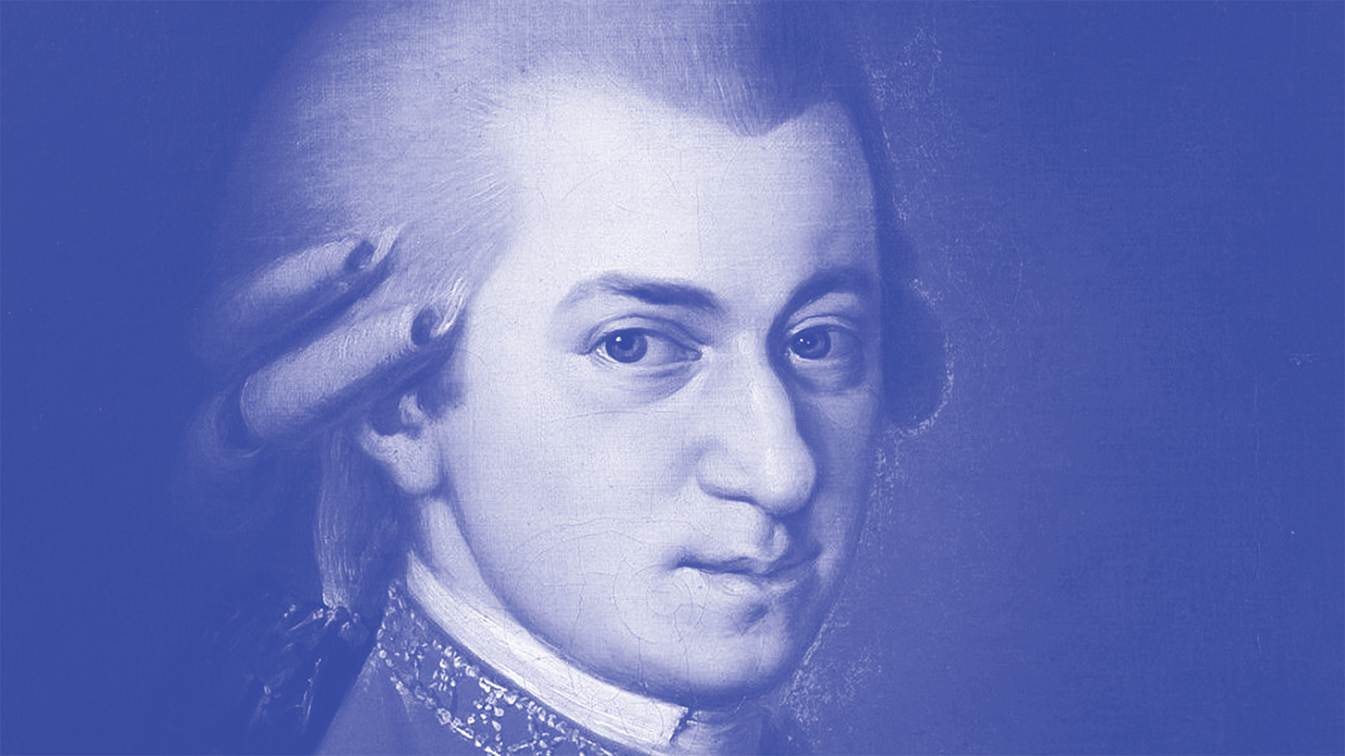
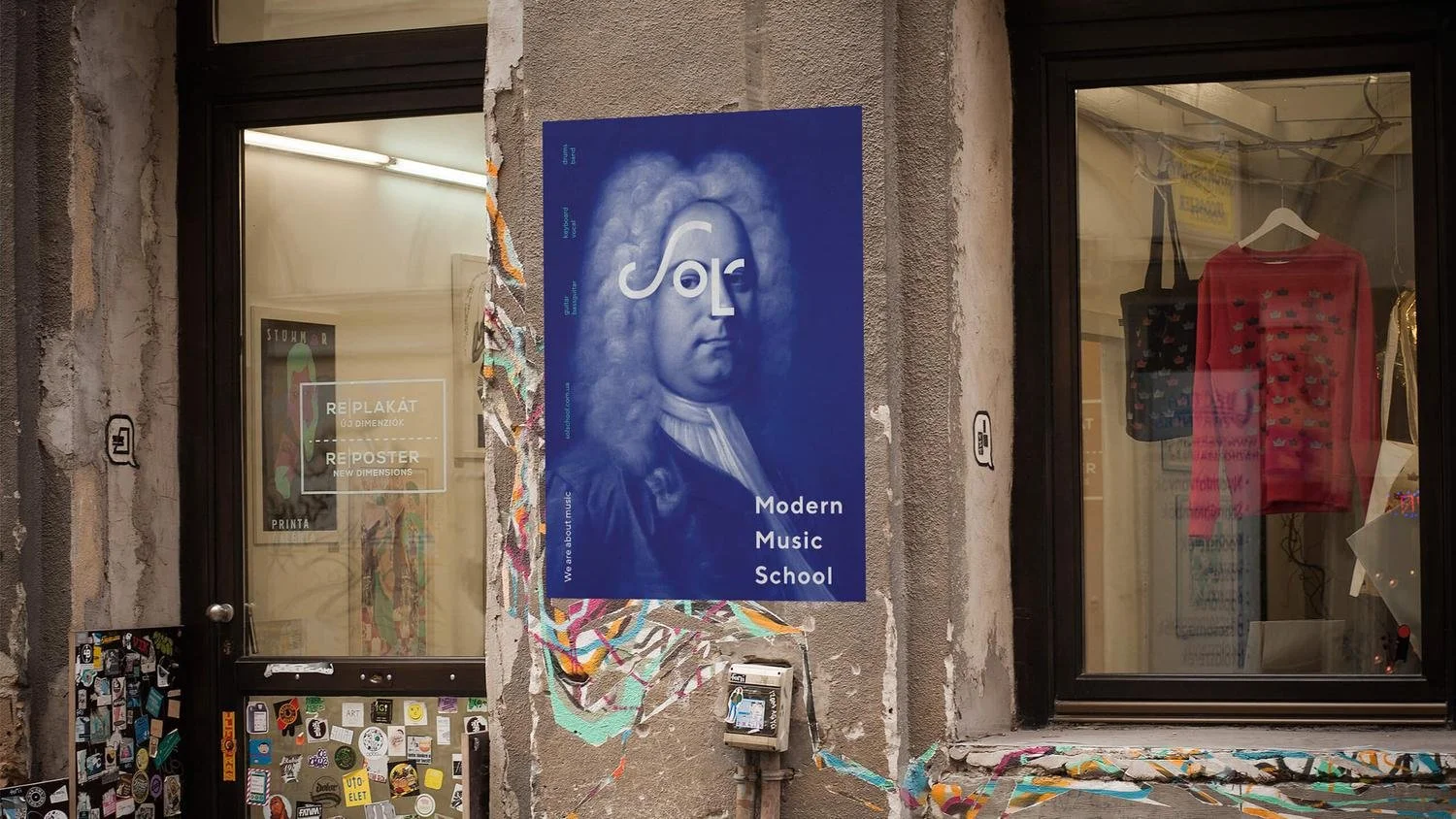
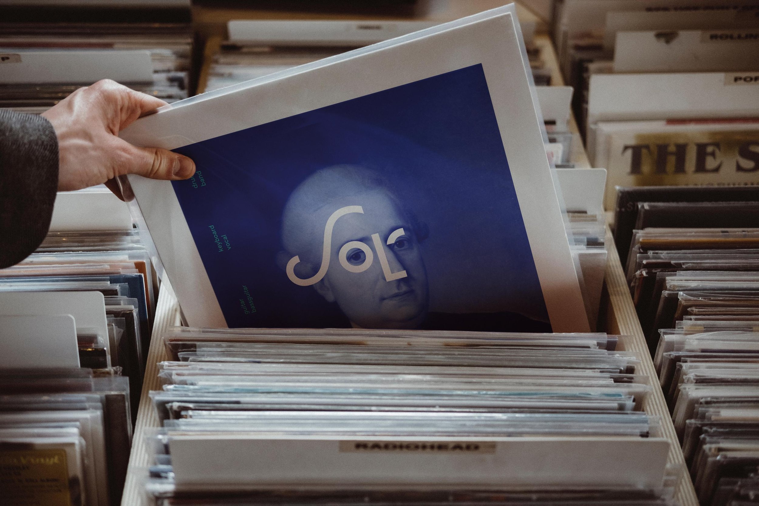
SOL’ is a modern music school without templates or boundaries for creativity and self-expression. Like anything truly new, it is built on clear classical foundations, but without academic rigidity. That idea is reflected in the school’s logo.
The lettering is overlaid onto classical portraits of great composers, emphasizing the continuity between the past and the future of music. The logo is fresh and simple, expressing its essence and the freedom that creativity provides. Today, the music of Kharkiv has a new face.
Task
To create an identity for a modern music school. The composition of the teachers is a young inspired and proactive team that burns with its work. What I wanted to display in the mood of the visual. Additionally there was a task to show that this is a modern music school, without categorical and strict limits, where everyone can express their creativity, while respecting the classical traditions.

Name meaning
the fifth note of the stave G (in Ukrainian the fifth note is called Sol’);
the word Sol’ is consonant with the word soul, and music is nothing more than a manifes-tation of the soul of the author, which strives to get into the soul of the listener;
in the Ukrainian language there is a meaning of the word Sol’, which means the essence, the meaning of something;
Sol - from Spanish - the sun. For any musical person, music is a kind of personal sun.

What I did
Lettering was born, which is a schematic representation of a face in a wig. I suggested using portraits of great musicians with a portrait logo on top, which would symbolize a modern approach to learning without abandoning classical roots and highlight belonging to the time with modern layout and bright colors.


Problem
When I presented the concept to the client, they considered it too daring for the city and asked for a different, more expected and traditional design approach. I did, but for each subsequent meeting I started with a conversation about the Concept of identity with the faces of Mozart and Haydn, giving new and new arguments as a result, the customer agreed to leave him and by the end of the project and after its completion several times expressed gratitude for perseverance.
Result
The project was innovative for the city. Prior to this, music education could only be obtained through traditional music schools or private tutors. The introduction of a modern music school with young practicing musicians who themselves play in bands or are part of vocal ensembles was a revelation for the city. large images of well-known musicians made it possible to unmistakably determine the subject of the message. and large posters, decorated in bright colors and complemented with branded elements, went viral and were often mentioned in social networks in the first months of opening.
As a result, the new identity helped to fill all the classes in the first few weeks of the school's existence. Visualization received only positive feedback from teachers and students, and the project itself has won numerous awards, including the Red Dot award.
